Photography by Patricia Burke
NYC - INTERIOR DESIGN WITH A POINT OF VIEW
Interior Design with a Point of ViewOne of the most optimistic things that we can do is to surround ourselves with beauty to inspire us to trust living a joyful life.
As an interior designer, I enjoy imagining and creating the setting for beautiful lives. Recently, I was invited to collaborate with longtime art and design clients on designing a three-bedroom New York City apartment.
Twenty-two years ago, I planned this client’s baby rooms and several additions. A friendship of design projects later, both of their girls now in college, I was honored when they asked me to work with their real estate agent to finalize their apartment choices and begin conceptualizing the design. The long relationship my clients and I shared allowed me latitude to create. I understood their lifestyle, aesthetic and expectations; they trusted and respected my design instincts.
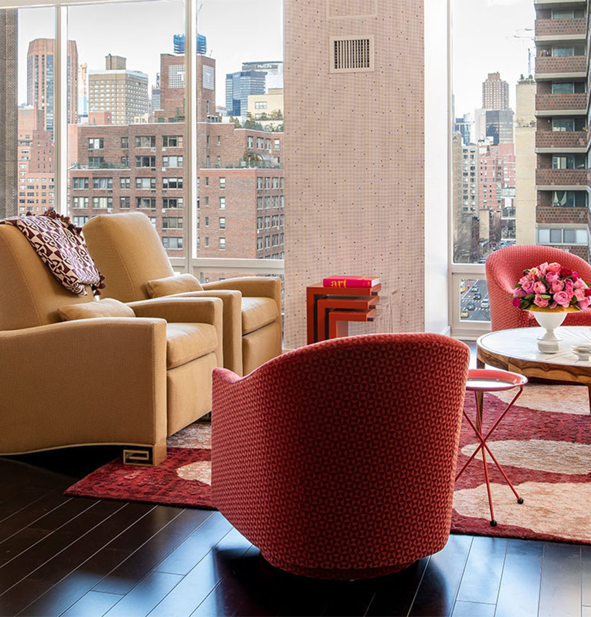
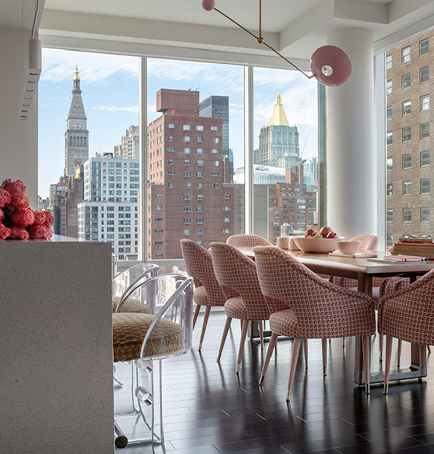
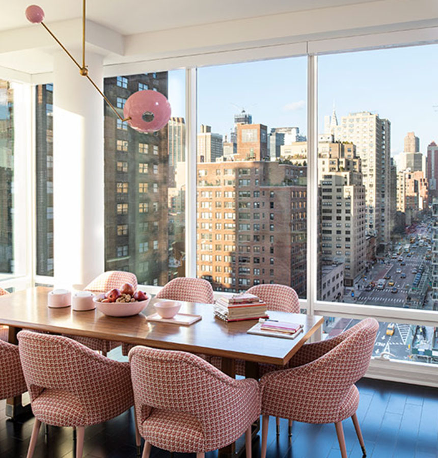
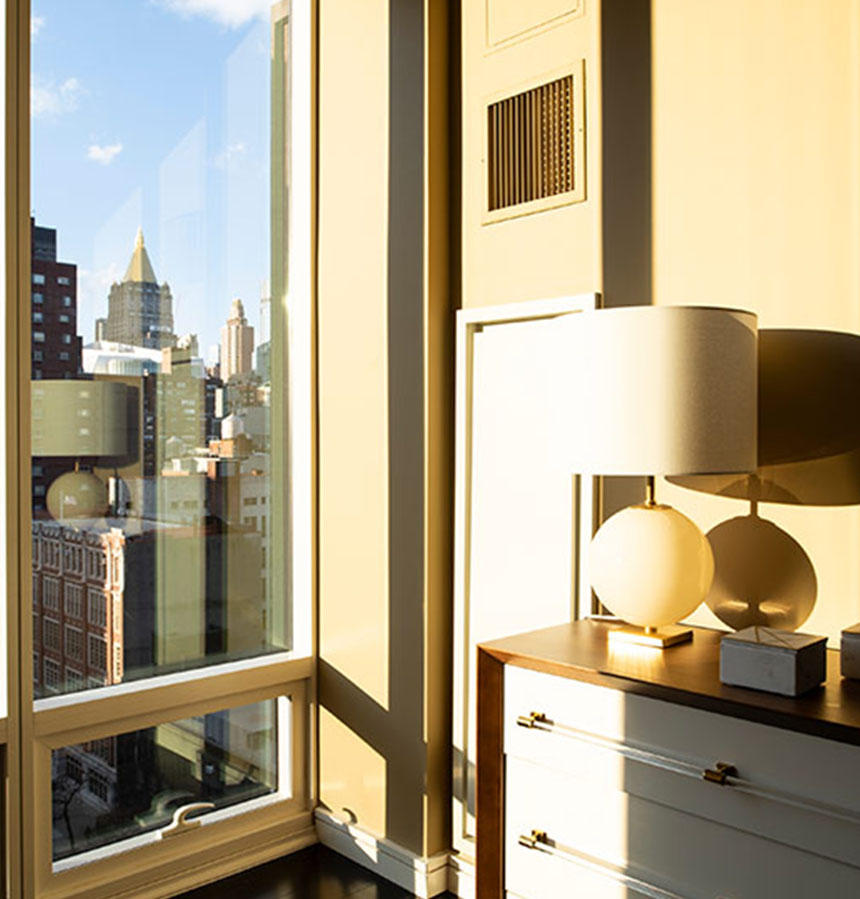
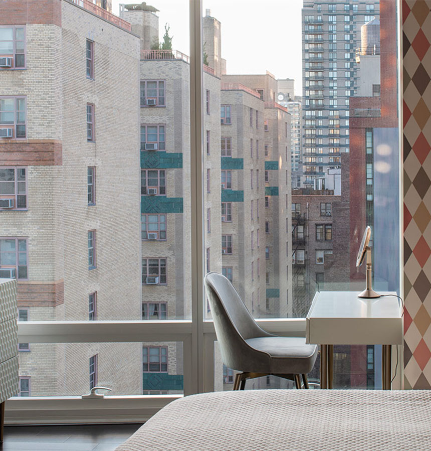
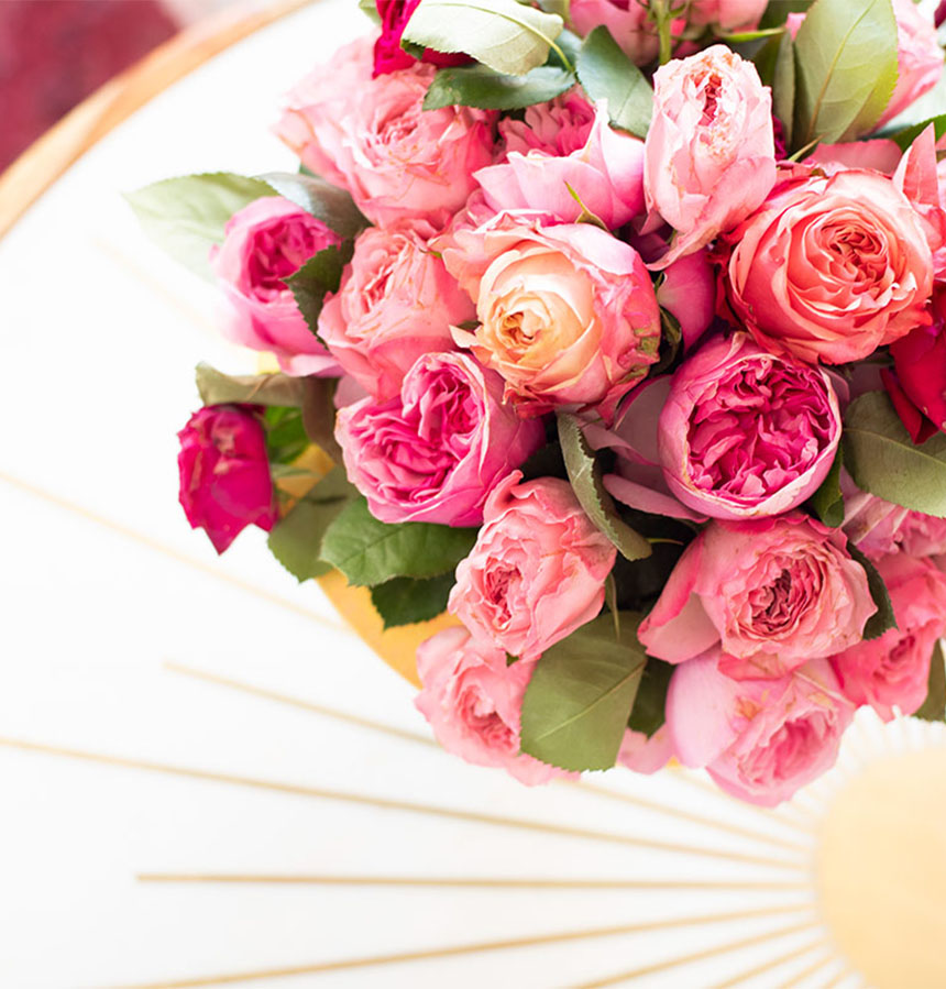
What struck me most with the apartment’s view were the soft pinks and pale yellows of the facades, which seemed to present a much kinder image of New York than what one would typically imagine in a cityscape. I presented the clients with a color palette in a bouquet of complicated pinks, camel colors and yellow-gold and brass to reflect the sunshine. I wanted the interior to engage with the scene outside, to create a space that felt like you were living in that view.
The challenge was to be sensitive to creating a balance between the outside world and the one within. Both needed to co-exist in harmony, to blend seamlessly in a way that one would complement the other. The design must appear effortless.
Using my knowledge of color theory, I pulled the colors from the view into the interior so that the apartment would match the excitement of this city that buzzes with culture and fashion. I wanted to embrace what is new in modern design and my idea of what “East Side classic” should look like, and that meant being a little “old school” as well in our choices.
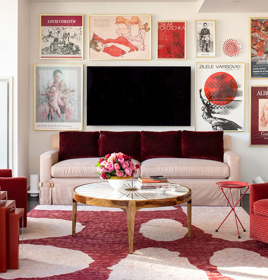
The original artworks in the entrance hall were complemented by a collection of museum exhibition posters, which surrounded the TV and were curated on color and hung against the backdrop of the expansive views. I found it exciting to use images of fine art usually only admired in art books to add a depth of subject matter. This design illustrates how art can be collected on many levels and present a sophisticated interior. It shows an appreciation and understanding of the definition of what fine art is and a respect for allowing art to be art and for decoration to be the shoulders upon which art stands to shine. I loved finding a way to incorporate exhibition posters that would showcase the fact that great art opportunities surrounded them and were as accessible as the expansive city outside their windows.
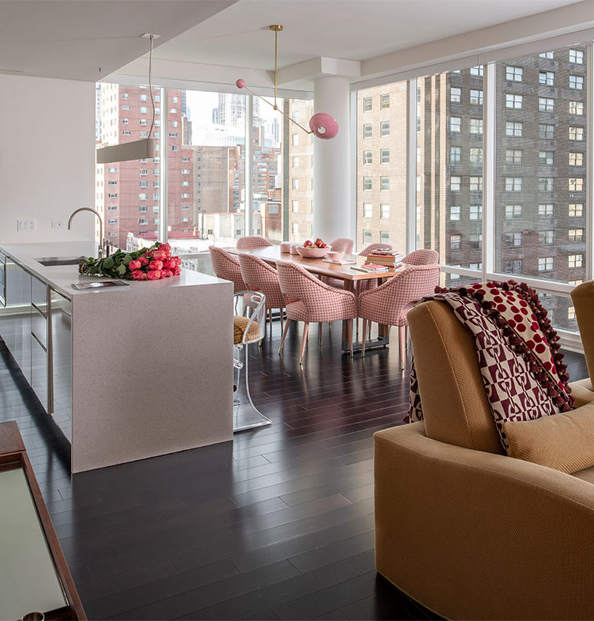
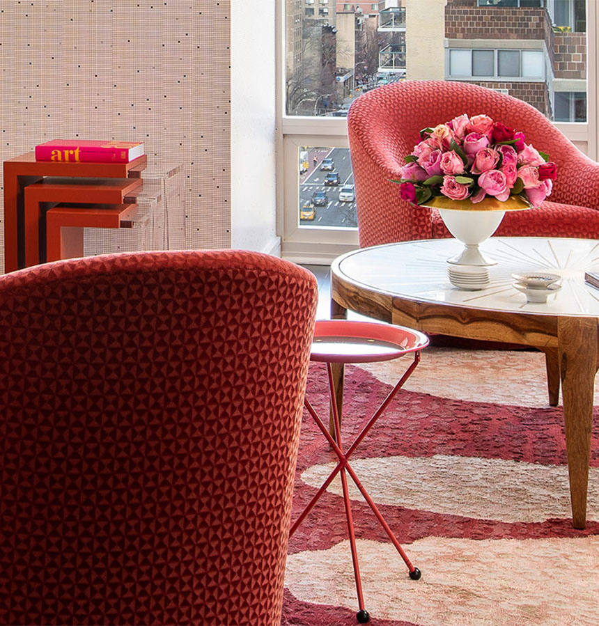
Fabrics from quality textile houses such as Clarence House/Hill Brown, Hermès and Lelièvre that mimic exposed brick and with sleek textures marry with the vibrant city scene below. Sunlight streaming in through the windows causes the brass inlays on the tables and on the lighting to gleam and picks up the gold-leaf details on the frames. The mosaic check pattern of the Hermès wallpaper on the center column wall quietly mimics the grid of windows outside and creates detail with its subtle lines without interrupting the view.
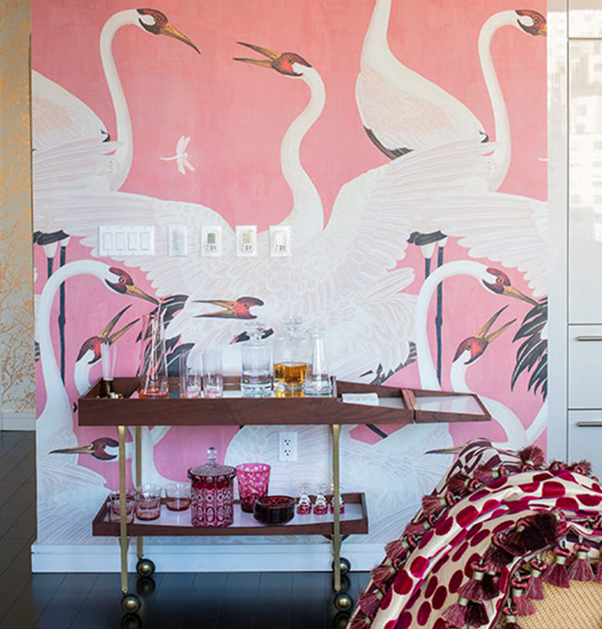
To further emphasize the sensation of living within the view, a custom silk/wool rug with organic shapes channeling clouds that float across the seating area adorns the floor. Also in the room, a sleeper sofa, a pair of both incliner and swivel chairs, and a walnut table with extension leaves allows for making entertaining traditions possible with life’s future celebrations. A vintage bar cart and bar parked next to an accent wall of landing herons and bustle about as if waiting in line. The bold paper holds its own opposite dramatic views of living where birds fly and still continue the quiet color palette. A GUCCI snack table adds additional mirth to the environment.
The dining chairs, stylish with their Dedar fabric and reminiscent of a Chanel bouclé, add to the melting pot of mixing patterns living harmoniously against the reticulated patterns outside. The chair legs — a nude color with gold caps — invoke the look of well-appointed pairs of shoes as if they were well-dressed hosts ready for a dinner party. A service of blush-colored Felt+Fat dishes are also on standby for everyday and holiday table setting.
In contrast, each bedroom with its adjacent bath was handled simply with a color selected to allow the continuation of themes as the clients’ lives continue to unfold, but the master bedroom is papered in a harlequin pattern as if a gift-wrapped box to pop out of each morning.
Throughout the residence, the décor offers a stage set for joy — well-appointed to do the apartment’s assets justice with a comfortable elegance that favors humor and good taste over pretense. It is a larger-than-life space that the clients can slip into effortlessly and enjoy a safe landing in a city with unlimited possibilities.


