I've been wanting to go back to the Louvre to spend some time inside and think about it as a beautifully designed building to house art. I do admit, whenever I am in Paris, just sitting in the square that surrounds the pyramid is almost enough to love the Louvre, to feel all it symbolizes as a great museum.
During my recent visit, I specifically honed in on the painting galleries, as I wanted to confirm all I've been deducing on my own lately about the rules and definitions of design that guide my interior design work as an art dealer. It forever amazes me to see such beauty and logic in design and ornamentation from the past. What is considered "modern" today is often so less fearless and forward than great traditionalism.
Again, what a treat to devote an afternoon to museum study...to wander and let the art speak and connect with no agenda other than to soak in what is offered.


Luckily for me, the art of the painting galleries provided me with an excellent foreword to the Delacroix exhibit, allowing me to better understand his unique contributions to the art of his times. Unfortunately, the big show catalog was only in French, and although the photos were beautiful enough for me to purchase it anyway, I do believe the exhibit might be traveling to the Met in NYC; perhaps an English version on its way.

Gallery owner James Yarosh with Barnet Cohn bicycling to the Louvre and surrounding sites, including the park at springtime across from the Louvre and the Hotel Regina.


Inside the painting galleries at the Louvre to see all of the layered beauty, colors, and craftsmanship of the interior design choices, to find climax in the art to exhibit it as the rightful focal point.

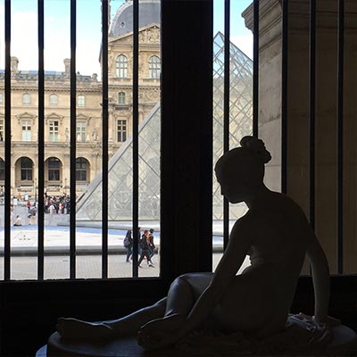
Antonio Canova's Psyche Awakened by Eros, 1787-93, and the view of I.M. Pei's Pyramid and courtyard from inside the Louvre.


Noting the deep neutral color palette that offered restraint and calmness to balance the gold ornamentation, frames, and gallery hanging.


Andrea Mantegna's Saint Sebastian, 1480, and Leonardo de Vinci's Virgin, Child with Saint Anne.

John Constable's Weymouth Bay as the Storm Approaches, 1819-27, and Joseph Mallord William Turner's Landscape with River and Distant Bay, 1835-40.

An early Renaissance three-part painting by Pietro Perugino, 1470-73.


The Delacroix exhibit poster at the Louvre 2018 and a photograph of the artist's sketchbooks.

(Above) Noting the bold use of black, the absence of color, as backdrop for the painting exhibition to make the art shine and (below) the use of a Prussian blue to surround the framed portrait with exciting color, bringing your eye's attention to what hangs on it.
I’ve been wanting to go back to the Louvre to spend some time inside and think about it as a beautifully designed building to house art. I do admit, whenever I am in Paris, just sitting in the square that surrounds the pyramid is almost enough to love the Louvre, to feel all it symbolizes as a great museum.

