MAKING OF: A DINING ROOM – TO LIVE IN
JAMES YAROSH ASSOCIATES FINE ART & INTERIOR DESIGN GALLERY
I attended the Mansion in May 2020 designer walk-through with an open mind to see what sparked an idea of something new to say. I was in love with the outside textures and variations of the same colors; within the estate, I was drawn to the dining room as an exciting place to explore. With its stone floor, patterned and aged as one might see in a museum floor, and light-filled space, it felt more like walking into a sun-room, a welcoming space that would beckon residents to congregate. And the existing, albeit time-ravaged, wallpaper made the room feel tasteful and important.
I was proposing more than a restoration scenario, but a more complete design update of the room to turn it into a full Design Show House space. I believe that design is a dialogue with the house and its architecture and character. Design should take an approach similar to art: You learn from and honor the past, but make the new creation marry with current times.
I began by curating a collection of paintings that could encircle the room and then realized a large, expanded round table in the center could create a focal point as the home’s official dining space. This also created a natural walkway around the room to view collections.
I wanted this space to go beyond an elegant, formal dining room that would serve solely as a setting for holiday tablescapes. It should be a space to be lived in. The beauty of home design is tailoring the space for its inhabitants, taking into account how they/we live. I decided to make this a comfortable, sun-washed room that could be used nightly for dining and for grand entertaining as well as be a space for residents to use like a kitchen table, to multitask on or upon which one could flip open a laptop — all the while surrounded by beauty.
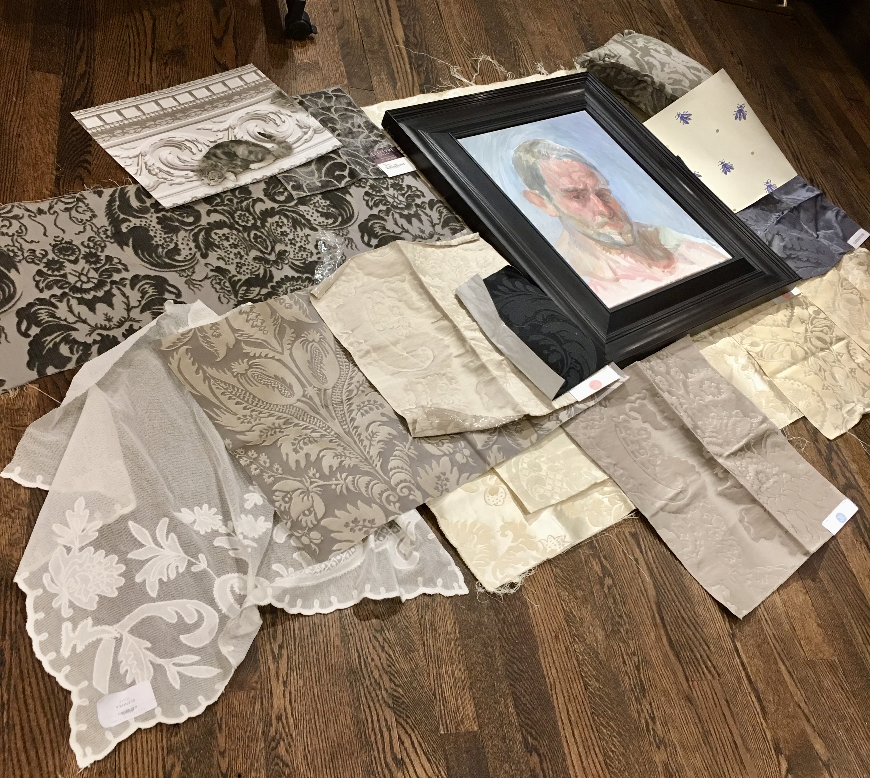
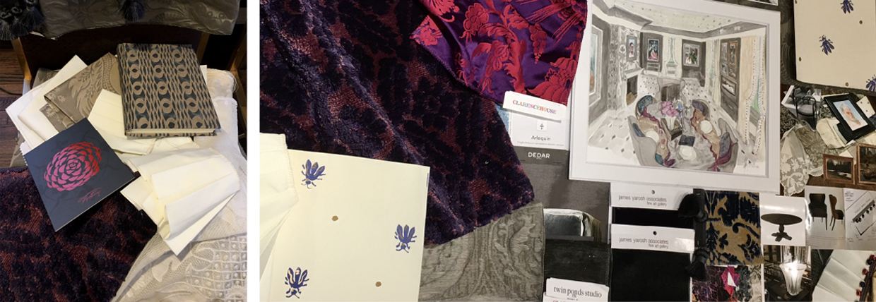
A charm of this room is its deep brown/gray coloring with its elegant, sober quality, and I want to keep a hint of that palette to honor the home’s history. I propose upholstering the fireplace wall with a dark taupe damask fabric and to marry the rest of the walls with a moire fabric wallcovering of a similar palette, which would deepen the room’s warmth and transition the former wallpaper to something still very lush and of quality. The window drapery would be a buttery cream silk on cotton damask to border the inner panels with a wide, a white-pleated fabric, potentially sheer, offset with a custom-colored trim of repeated pearls wrapped in an alternating shock of purple and red threads. Also, I would use a formal lace panel as a dressing for the glass door leading to the back as a romantic way to diffuse the light and to pull back and frame the stately view of the exterior surfaces and patio.
The overall palette would be shades of taupe, gray and neutrals, a restraint of color that would allow the space to be washed with textures and variations of the purposeful same colors. This would provide a backdrop for the details to shine, like the art and the doublefaced tablecloth with its gray, semi-sheer Valentino design pattern lined with another historical silk damask pattern of regal purple and red. Art books topped by a vintage Lalique vase filled with peonies would be stacked on the tablecloth, which will turn and fold across the table.
Since the room has an outlet in the center of the room, but no chandelier, an electrified Saint-Louis colored cut-crystal candelabra will stand on the table alongside amethyst- and ruby-colored Saint- Louis stemware and plates, which are still to be determined but which will be of equal importance and excitement. The goal is for the table and room to feel as if they’re often used and represent a more everyday way of living effortlessly with beauty.
The four larger upholstered wingchairs with 1920s lines in elephant-gray velvet and matching grosgrain flange alternate with the clean lines and similar curves of midcentury armchairs that also sport a gray mohair, which deepens the color scheme and hopscotches past decades to bring the design more into the present, to make it fresh and young and not only a recreation of the past.
Rich Venetian velvets in historical patterns in Prussian blues and more taupes and silks will fill the seats with pillows to circle the table to create a ring of beauty and historical definitions of how the boldest traditional patterns of the past not only stand the test of time, but also rival the boldness of what is considered “modern” today.
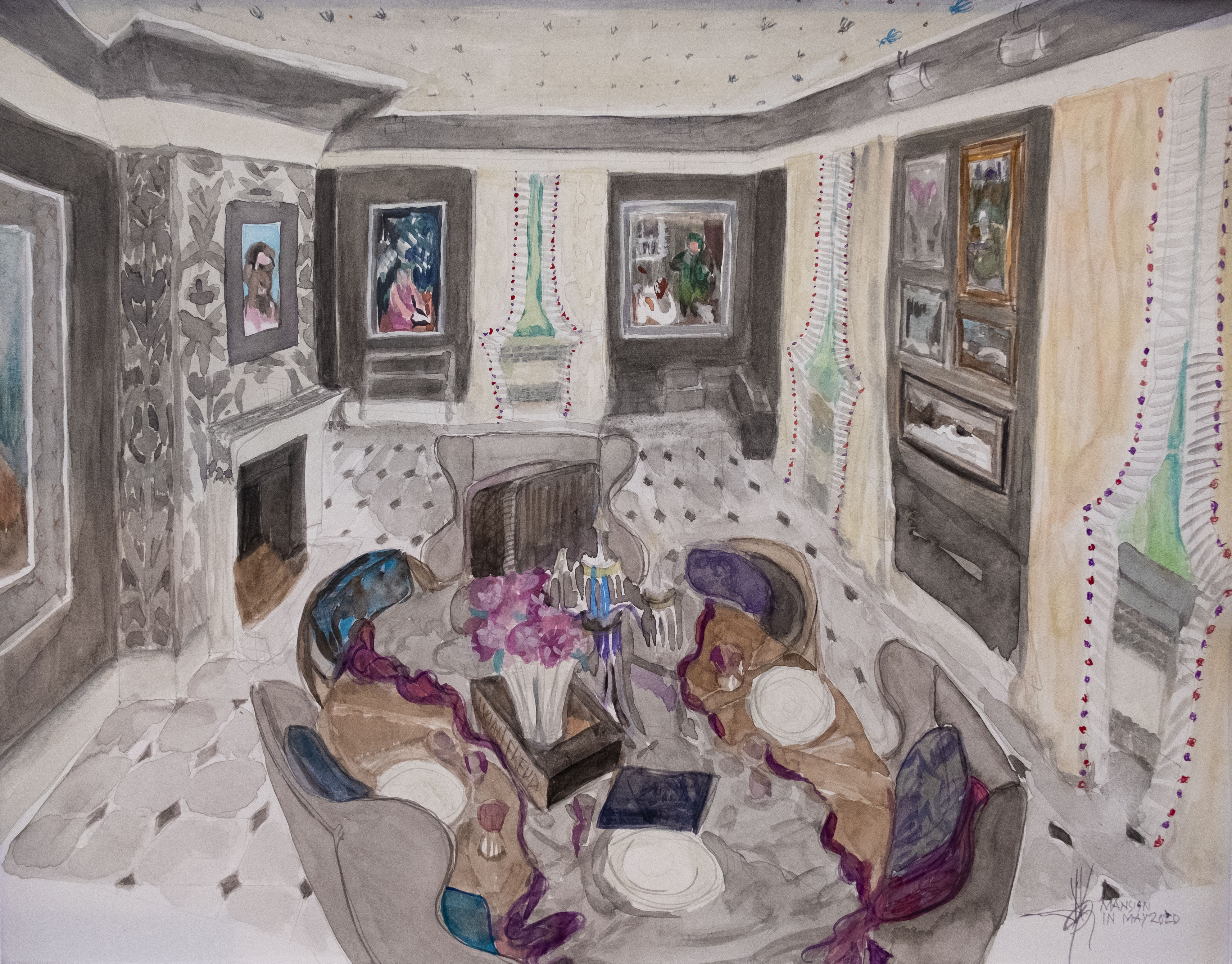
At first glance, the room may appear to be a gray/taupe palette, but the colors are to be used with purpose to not only reflect and connect to the home’s outside colors and to set the stage for lively painted subjects and regal color, but also for life … that often requires equally bold inspiration to live it fully. The ceiling will have a wide, painted border in a transitional shade of gray again and then surface trimmed in panel molding to allow a perimeter track of lighting to be nestled between, allowing an illumination of the room’s objects. The inner field of the ceiling — wallpapered in a hand-blocked pattern of royal bees creating a room forever in the season of rebirth and that echo the patterned floor. This important element of wit and mirth keeps this formal room inviting and boldly design-forward for the sophisticated tastes becoming of a formal estate.
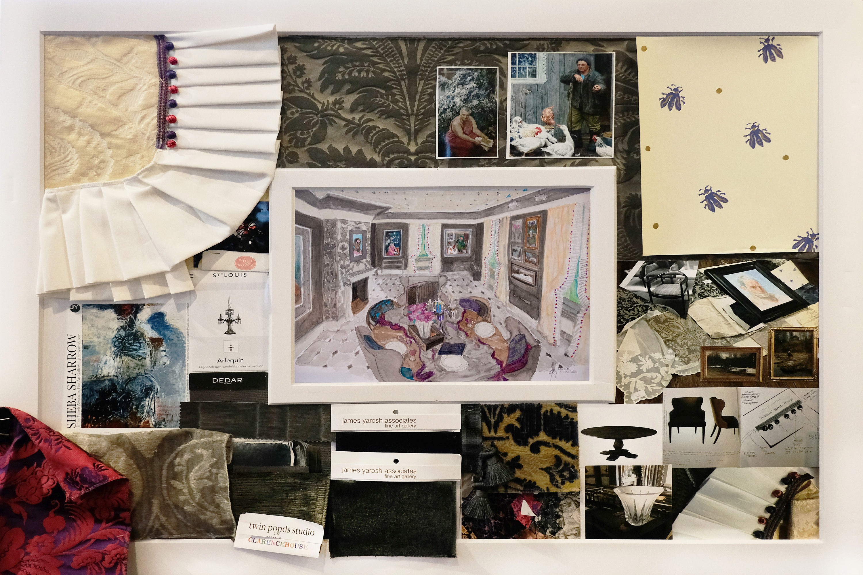
The room would be composed to allow the color and interest to come from the art and objects d’art, like a painting that surrounds the room, telling visitors a story and inviting them in. The rich textures and various shades of warm taupes will show the restraint of the color palette until the room’s royal accent colors, derived from the art collection, are used to guide the eye around the room with visual intent to reveal details that are apparent after prolonged study beyond the initial impressions.
Secondary furniture like teacarts, buffet stands and settee pieces also would be explored to surround the room as the design concept matures. A layering of antique carpets under the table was being explored, as is possibly off-centering them to create a designated area across from the door to the outside. A custom silk rug with a repeat pattern in deeply saturated shades of magenta and purple is likewise being investigated as a means to deepen the room’s low lights to allow the highlights to shine.
The art collection will include a self-portrait by England’s Charlie Shaffer, who won first prize at the 2019 BP awards at the National Portrait Gallery in London, which will be housed in a wide, 19th-century Dutch design frame and will proudly sit upon the damask-covered fireplace wall. Shaffer’s work represents the deep commitment artists have for their creation and the great burden and toll it takes on one’s self to create outside the norm, beyond the shallow and be true to their calling. It is a statement to declare that such noble artists’ minds deserve not only a place at life’s table, but also a place of honor in our daily lives. Like all the artists the gallery has championed for 23-plus years, it is art for art’s sake that leads – just like in design.
Works by Russian-trained artist Iliya Mirochnik, Ivan Kugach and Nikita Fedosov will marry the color palettes curated for the room in terms of their quality and storytelling subjects. Vachagan Narazyan’s Old World subjects, featuring a traveling circus, will be housed in a star-covered sgraffito frame, adding the repeat pattern at the room’s entrance on the left. A large red/lavender and purple Expressionist painting by Sheba Sharrow will sit stage right on the wall. It will only catch the eye once the visitor is inside the room as the space is hidden from the entrance and exit. This allows for an additional discovery of the origin for the room’s primary color source and serves as the room’s beating heart and leads the dynamic room curations.
The design of this space tells many stories, but will become an example of my design work’s main philosophies of diagnosing a room and letting it speak. Visitors can likewise read its design direction as I did on my initial visits. The room will show how layering beautiful surfaces like floors and walls, and drapes and textile-covered pieces and then adding beautiful objects — vases, china, tureens, crystal — heightens the excitement and creates visual support. It will show how fine art sits on top of this hierarchy, not as additional decoration, but as works that add intellectual depth and can speak of our times as symbols of culture.
This hierarchy is important for educating and forming a deeper understanding of the benefits of living with art in our personal spaces, to show how it nurtures our souls and makes our homes a haven. But more importantly, it is our responsibility to support and nurture the arts and artists who explore feelings and subjects that can connect us all in ways words alone cannot, allowing us to benefit and find common hearts and empathy for each others’ experiences.
It’s always so exciting to begin new projects especially when, like in the case of this dining room as part of a larger estate, it speaks to me as a space that aligns with my artistic sensibilities and definitions of how fine art and interior design meet.
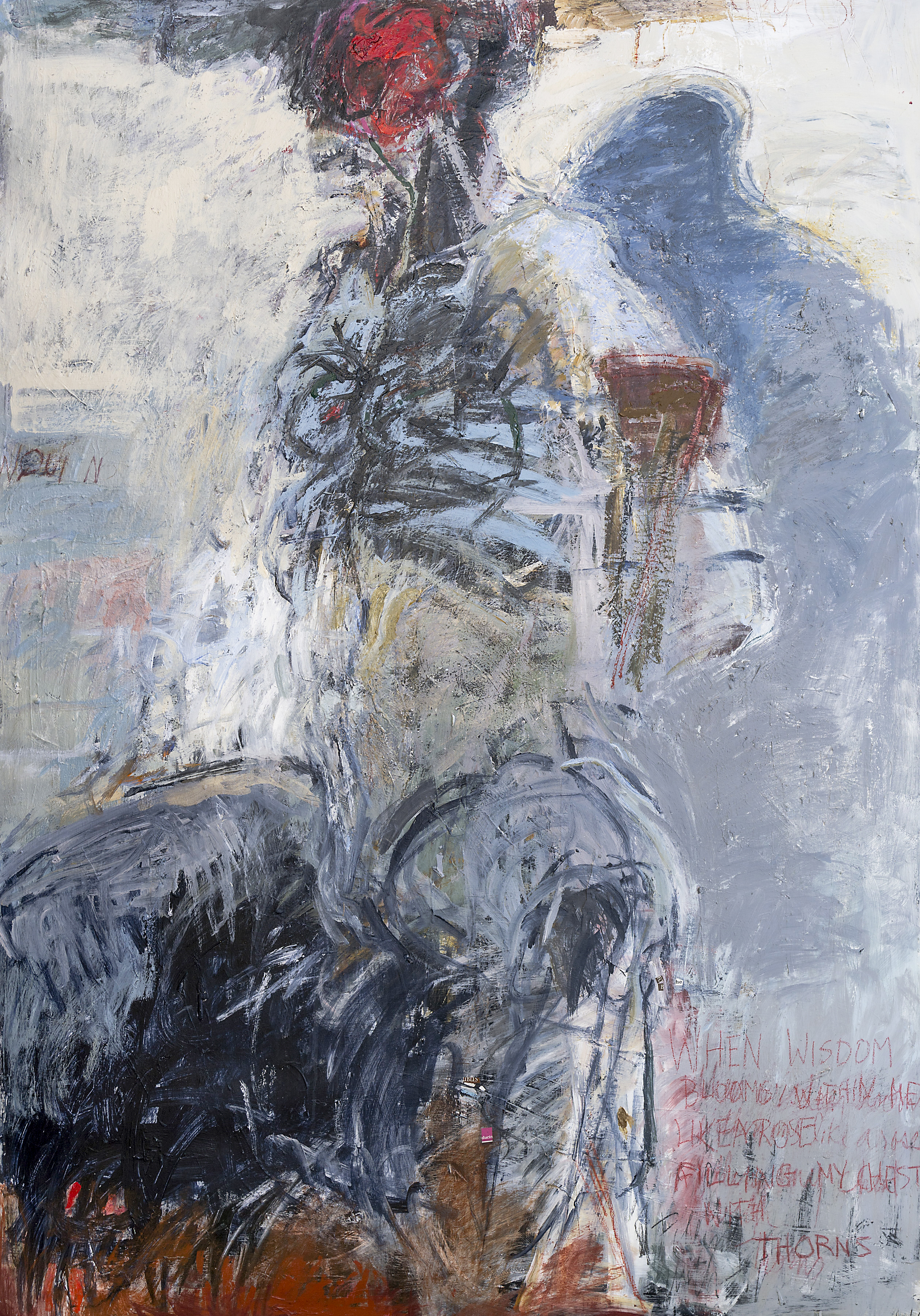
Bound Figure, 1995, 74 in x 51 in, mixed media on Arches paper
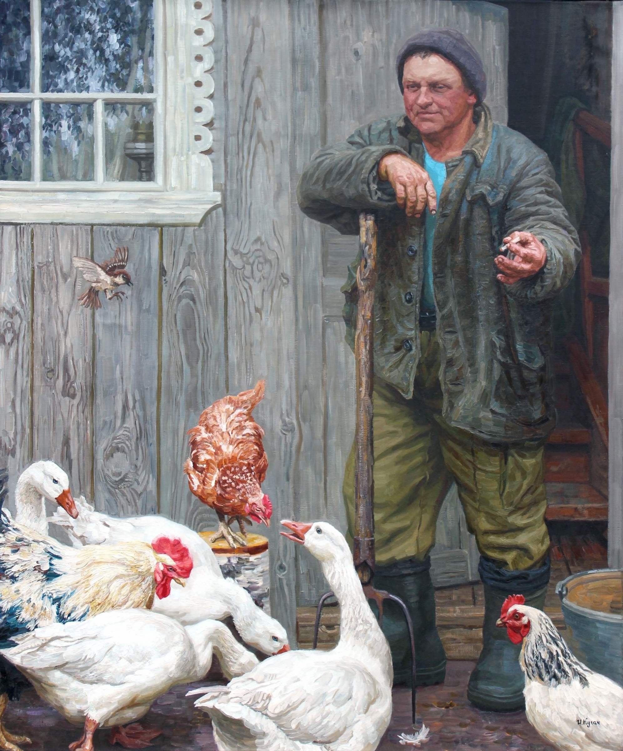
Ivan Kugach, “The Master,” 2012, 47 in x 39 1/2 in, oil on canvas
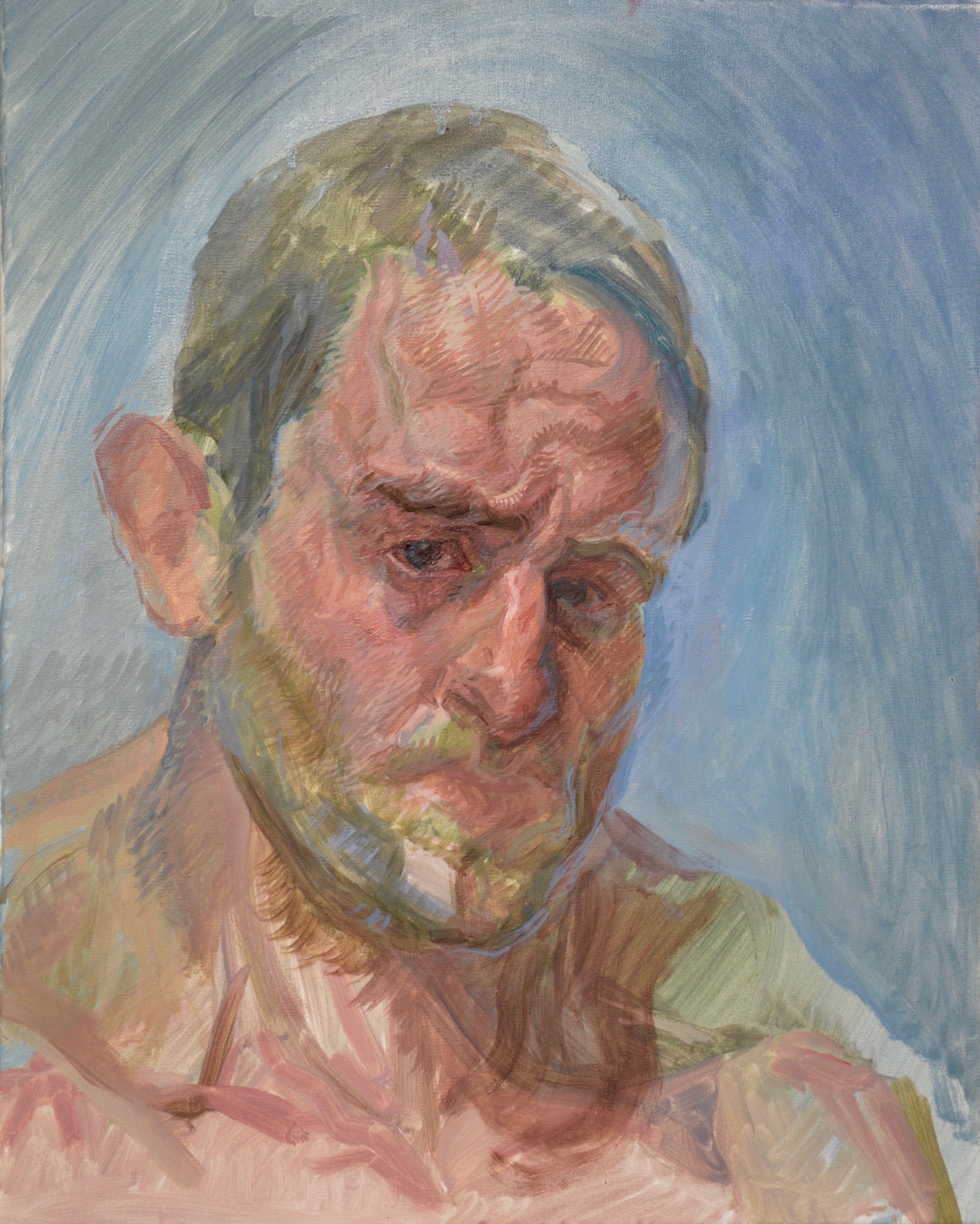
Charlie Schaffer, Winter 2018-19. Oil on linen, 19 x 15in
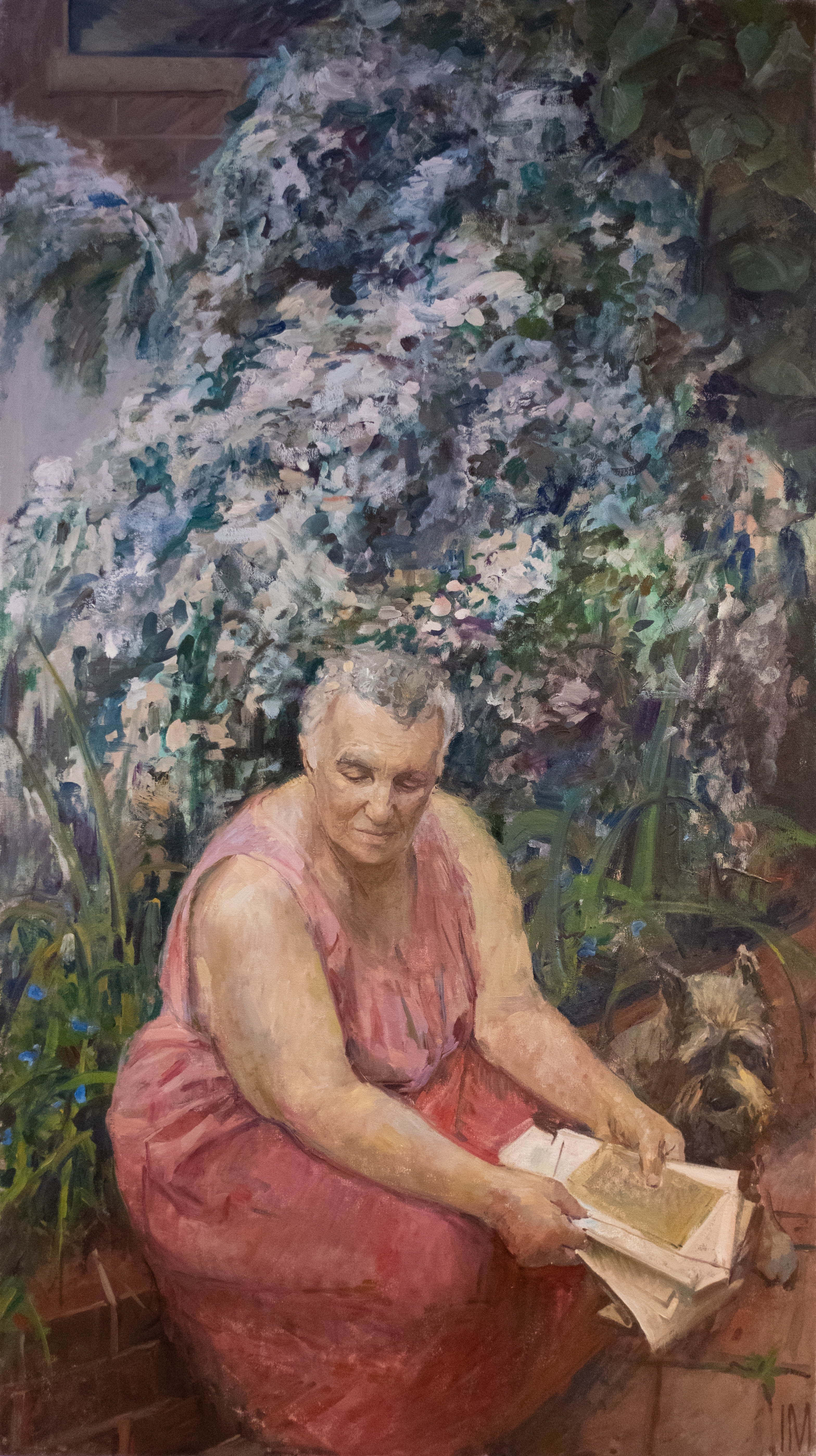
Iliya Mirochnik, “Old Letters,” 2014, 64 in x 36” oil on canvas
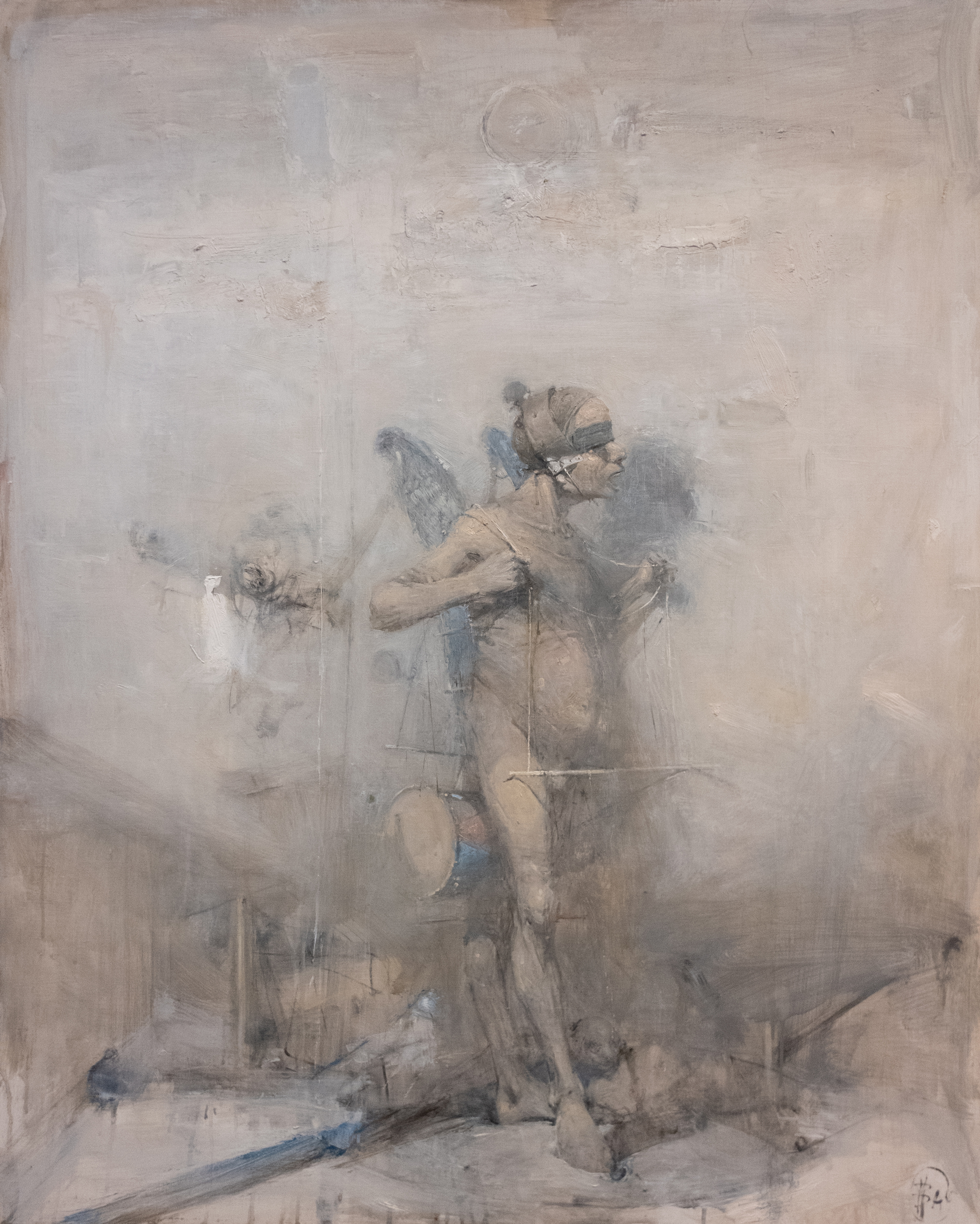
Vachagan Narazyan, “Pilgrim,” 2004, 35 1/2 in x 28 1/2 in, oil on canvas
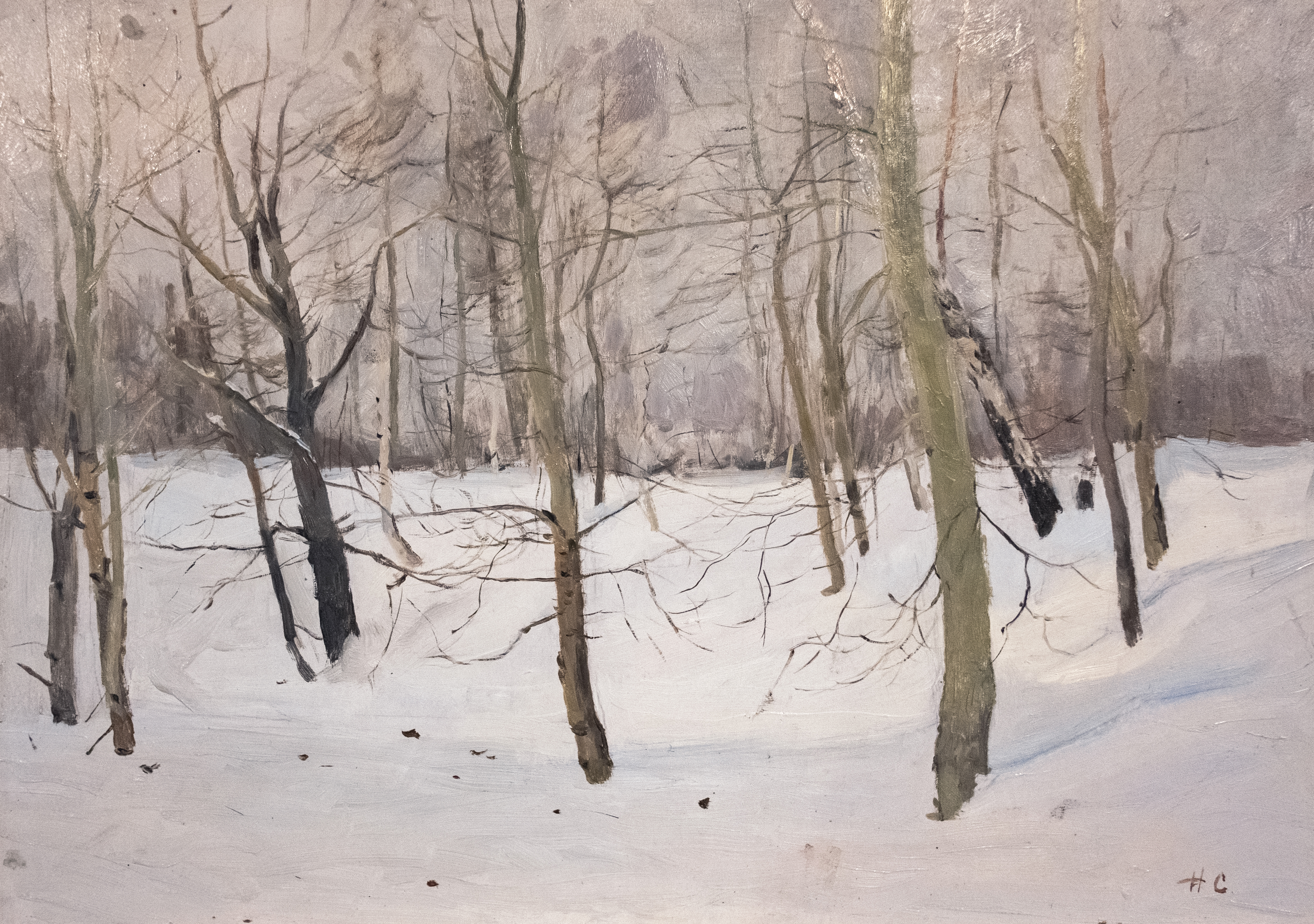
Nikoli Sergeyev, “Small Winter” (Trees Dancing/ Ring Around The Rosey), 1957, 13.75 in x 19.5 in, oil on canvas
